
 Pin it
Colors do not become off-limits at a certain age, but some shades can look harsher against skin that is naturally changing over time. This guide shows you how to spot five color families that may dull your glow after 50 and how to replace or balance them. Use it as a practical wardrobe check, not a rulebook.
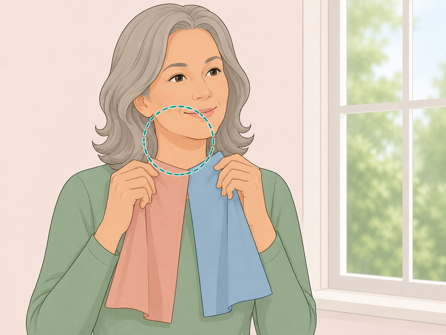
Check your colors in natural light
Stand near a window and hold clothing under your chin before deciding whether it flatters you. Skin can become thinner, drier, and less plump with age, according to the National Institute on Aging, so shades that once worked may look different now. Look for colors that make your face appear clear and rested, not gray, yellow, or shadowed.

Soften harsh black near your face
Black can look chic, but its very dark value can create strong contrast around the face. Utah State University Extension explains that color value is the lightness or darkness of a color, and that value changes how a color is perceived in clothing design. If black feels draining, wear it lower on the body or break it up with charcoal, navy, plum, soft white, or a flattering scarf near your neckline.
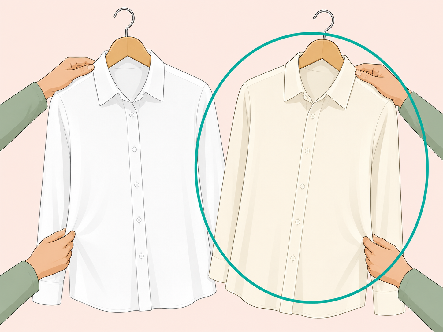
Swap stark white for gentler whites
Bright optical white can bounce sharply against the face, especially if your coloring is soft or warm. Try ivory, cream, oyster, stone, or soft white instead, then compare both shades in daylight. The goal is not to avoid light colors, but to choose a white that brightens without making your skin look flat.
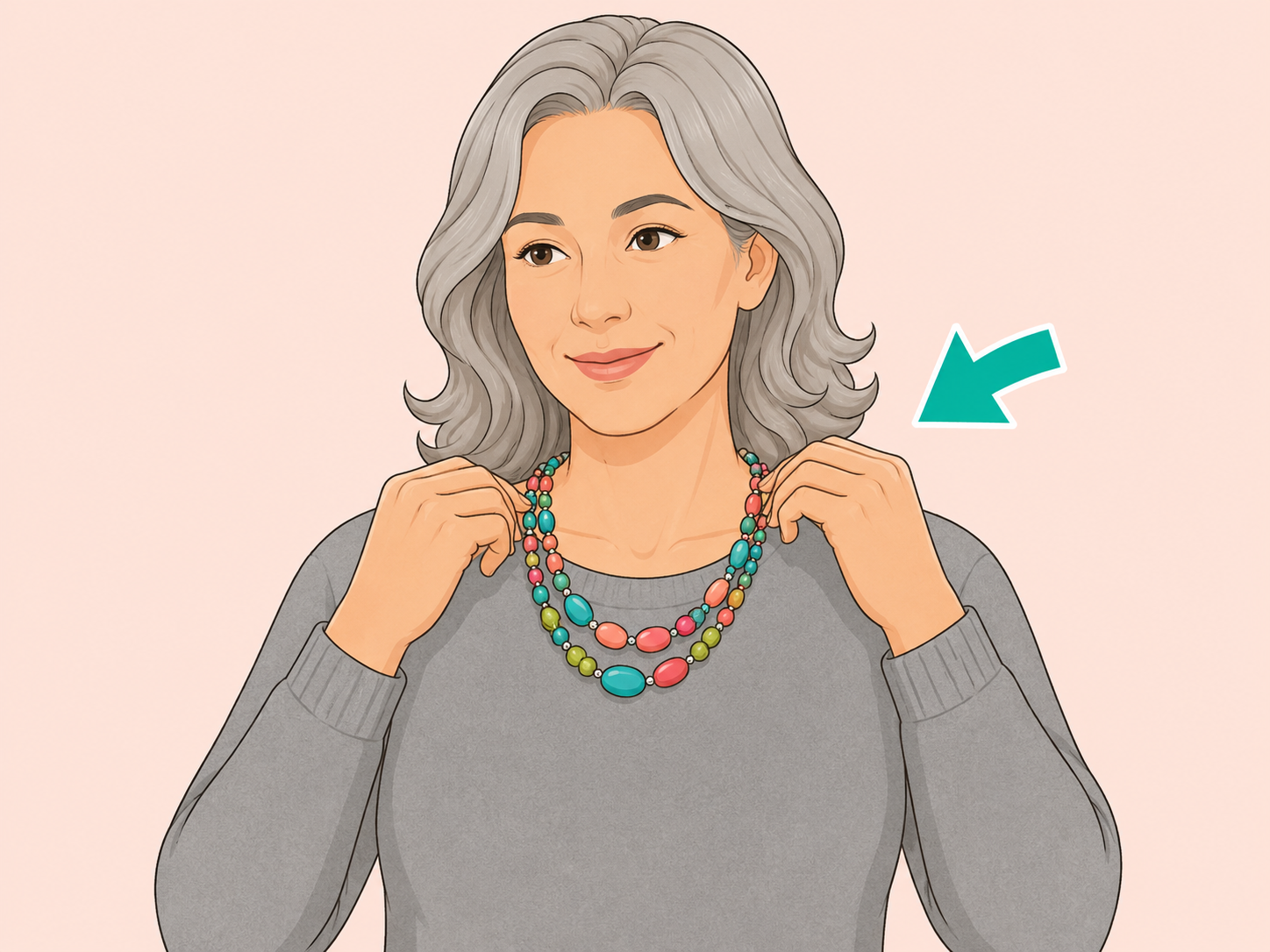
Warm up flat ashy gray
Ashy gray can echo dullness if it is too close to your hair or skin depth. Choose a gray with more life, such as pearl, dove, pewter, blue-gray, warm greige, or charcoal. If you love a gray sweater, add earrings, lipstick, glasses, or a scarf in a clearer color to bring attention back to your face.
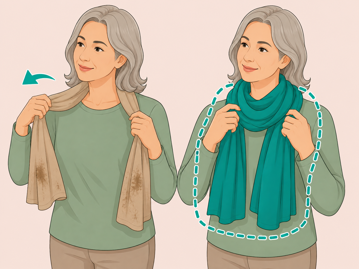
Move muddy beige away from your neckline
Beige, camel, tan, and khaki can look elegant, but muddy versions may blend into your skin and reduce contrast. The University of Georgia Extension suggests finding color families that look best on you and building wardrobe choices around them. If beige washes you out, keep it for trousers, coats, or accessories and place rose, teal, berry, navy, cream, or green near your face.

Use neon brights in smaller doses
Neon pink, acid yellow, electric lime, and very bright orange can overwhelm softer coloring because they have high intensity. Utah State University Extension describes intensity as the brightness or dullness of a color in design. If neons make your skin look sallow or tired, try clearer but calmer versions, such as coral, raspberry, teal, emerald, cobalt, or warm red.
Test one color family before buying more
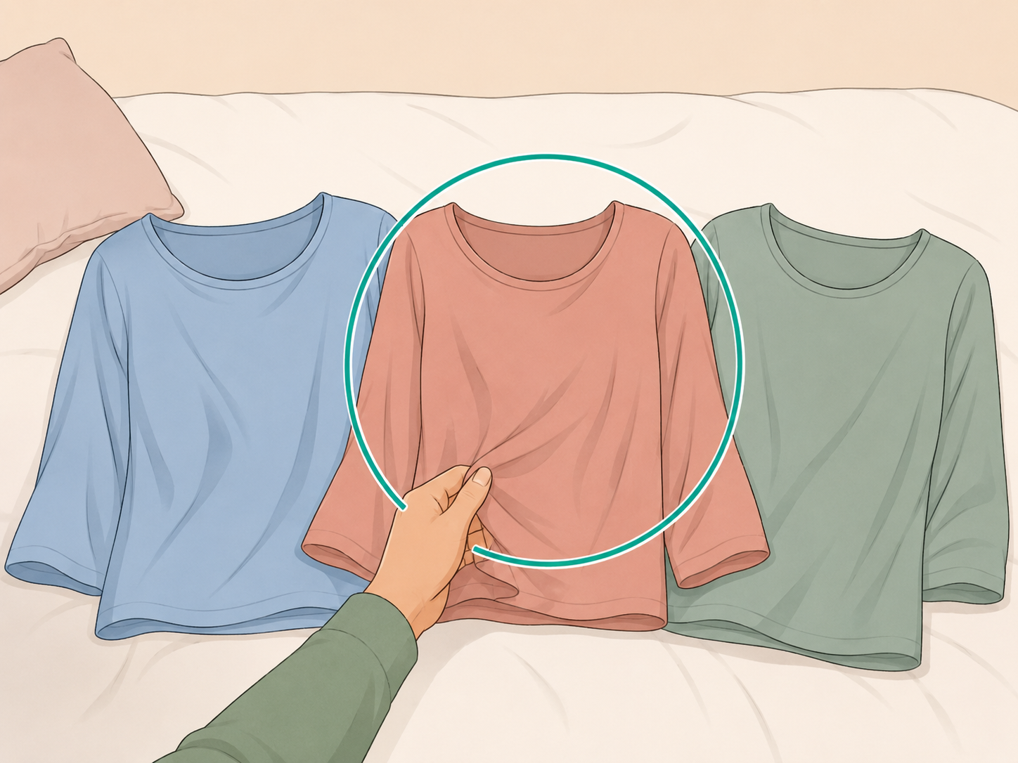
Choose one problem color from your closet and try three nearby alternatives before shopping widely. For example, compare black with navy and charcoal, or stark white with ivory and oyster. The University of Georgia Extension recommends considering whether a garment is a flattering color and whether it coordinates with the rest of your wardrobe before buying.
See a doctor for skin changes that worry you
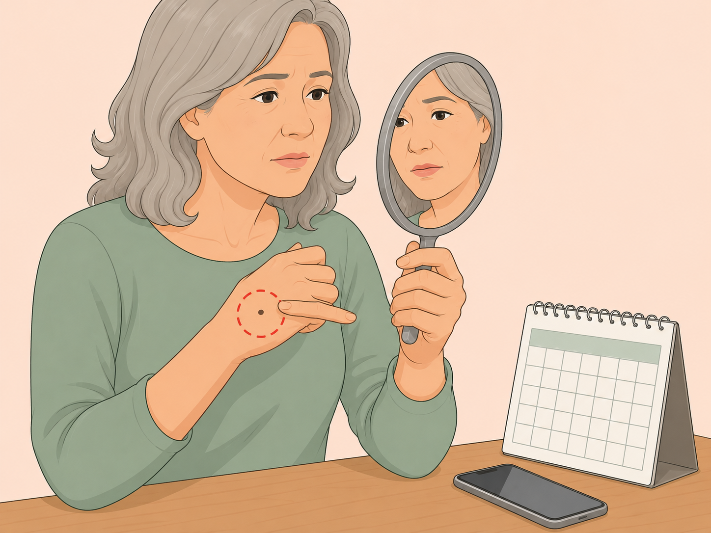
Clothing color can change how your complexion appears, but it cannot explain new, changing, bleeding, itching, or non-healing skin spots. The American Academy of Dermatology says skin cancer can appear in several ways and recommends seeing a dermatologist for a suspicious spot. The AAD also notes that skin in the 60s and 70s may become drier, thinner, blotchier, and more easily irritated, so real skin concerns deserve medical attention.
Summary
The bottom line: the most flattering color is the one that makes your face look rested before you add makeup or accessories. If black, stark white, ashy gray, muddy beige, or neon brights make you look tired, move them away from your face and choose softer, clearer versions instead.
Frequently Asked Questions
- Do I have to stop wearing black after 50?
- No. If black feels too severe near your face, wear it as pants, skirts, shoes, or bags, or soften it with a scarf, necklace, open neckline, or jacket in a more flattering shade.
- What is the easiest color swap if white looks too harsh?
- Try ivory, cream, oyster, soft white, or pale blush. These shades still look clean, but they usually create less glare than bright optical white.
- Can gray still look good after 50?
- Yes. Many people look polished in gray, especially if the gray matches their undertone. Try pearl gray, dove gray, pewter, charcoal, blue-gray, or warm greige instead of flat, dusty gray.
- How can I tell if a color washes me out?
- Hold it under your chin in natural daylight. If your face looks dull, shadowed, yellow, gray, or more tired, try a nearby shade that is softer, clearer, warmer, or cooler.
- Are beige and tan always aging?
- No. Beige can be elegant when it has enough contrast with your skin or the right undertone. If it blends into your face, add a richer color near your neckline.
- Should I choose colors based on age or skin tone?
- Skin tone, undertone, contrast, hair color, and personal taste matter more than age. Age can change skin texture and coloring, but it should not limit your style.
References
Reliable references aided in composing and refining this content.
- https://www.nia.nih.gov/health/skin-care/skin-care-and-aging
- https://www.aad.org/public/everyday-care/skin-care-basics/care/skin-care-in-your-60s-and-70s
- https://www.aad.org/public/diseases/skin-cancer
- https://extension.usu.edu/research/elements-of-design
- https://site.extension.uga.edu/textiles/quality-and-selection